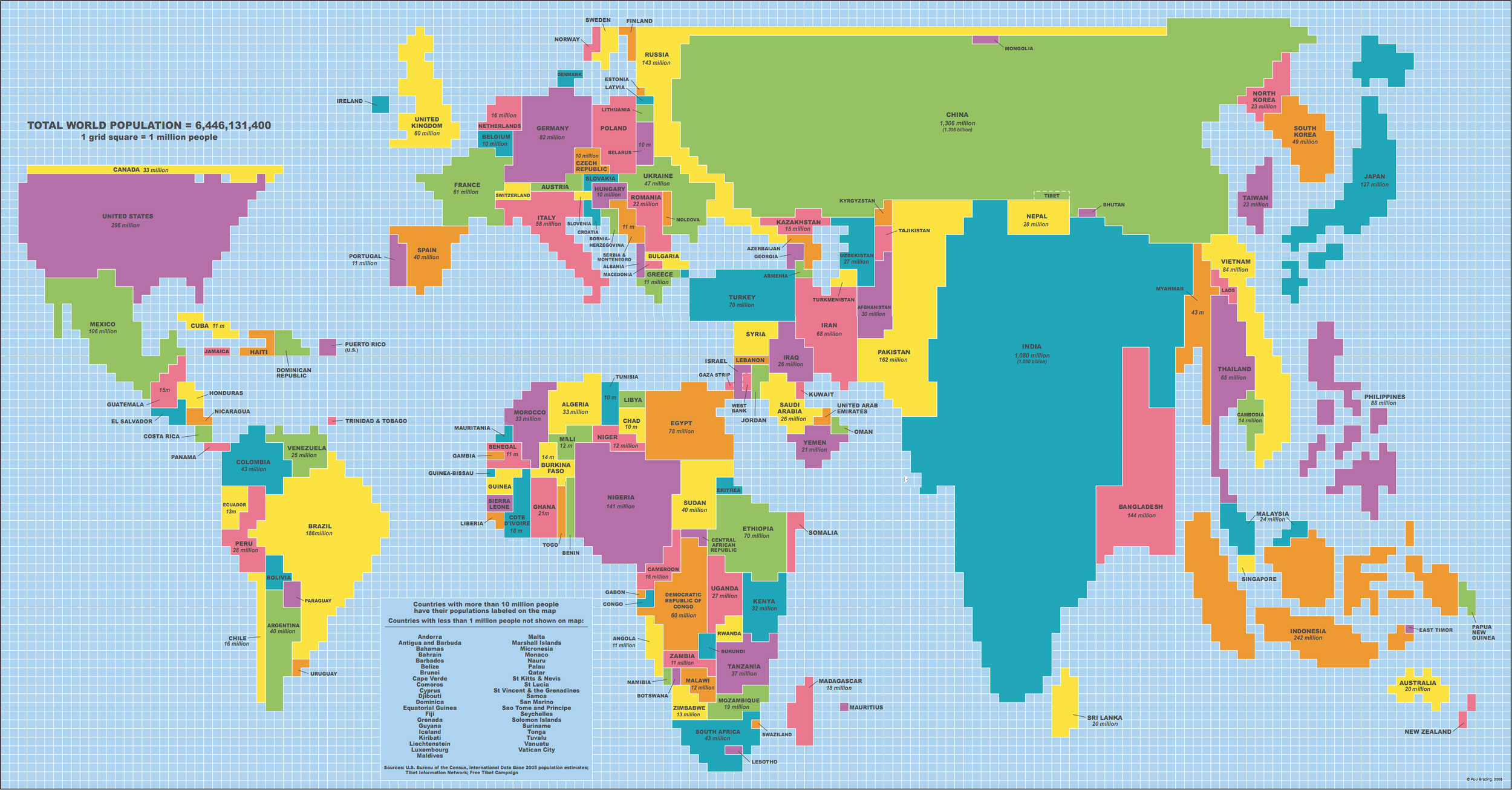
The World Map According to Population
 I came across this great image last week. It creates a world map according to population size instead of geography. Countries are located in the same place you would expect to find them but with varying sizes. Bigger population sizes inflate countries while smaller populations decrase the footprint of any given nation state. Check out Canada and India; what a difference! It is amazing to imagine our world drawn up with different boundaries.
When was the last time you took a look at the world from a different point of view? I have a sister serving at-risk children in Cambodia. Talking with her helps me to realize the dramatic chasm between my reality and hers. I was listening to a documentary that discussed the efforts of India's poor trying to rise up from desolate poverty. It reviewed the success stories of master garbage collectors and their coveted lifestyle including bottled water and hinged doors. We should try to step outside of ourselves and view things from other angles. It is a revealing and insightful experience.

